Recreating Visualizations - CodeEval
I come across great visualizations every day. Every time I see one I now start thinking about how I could recreate it using SVG or even how I could improve it. The RecreatingVisualizationsseries of blog articles is going to explore some of these.
There was an interesting little article on reddit a few days back about some of the most popular programming languages of 2012. The results are a bit questionable but I did like the visualization they used. I say that the results are questionable because CodeEval are only looking at their own site’s results. They failed to state that clearly. To me the gold standard of programming language usage statistics is TIOBE. They publish their methodology openly and I cannot find fault with it. However their visualizations are not very attractive. Let’s see what happens when we combine the great visualizations of CodeEval and the statistics of TIOBE using d3.js.
A common mistake with bubble graphs of this sort is the scale of the bubbles. When building the graph we use the radius of the circle to draw the circles but if we use the radius directly to scale the circles then we actually end up with inaccurate circles because the surface area of a circle is pi * r^2. We need to adjust for this when building the graph by taking the square root of the value as the radius.
To start we build the data by copying and pasting from TIOBE
If you’ve read my multi-part series on introducing data visualizations for HTML5 then this should all look pretty familiar. If you haven’t read it then you should! I worked hard on it.
Initial Bubbles
Here we are setting up a new entry in our Graph module. You’ll notice on line 15 I set up the square root scale and set it to fill the entire width of the SVG. This is a bit of a naive approach and we’ll refine it later. We also placed each bubble in a row so none of them would overlap. It is going to look like
Heck, already that’s kind of nifty. If we compare it with the CodeEval one, though it doesn’t have the same sorts of cool over laps and we’re missing labels. The labels are easy so let’s start with them.
Labels
In a previous post I mentioned that it was difficult to center strings in an SVG. This, as it turns out, isn’t true! You can make use of an attribute called text-anchor which sets where the anchor point is for a block of text. In our case we want to set its value to “middle” which means that whatever x value we gave should be treated as the center of the string.
This will add the name of the language to all our bubbles. You’ll notice that for the x and y values I’ve taken the values from the data array. In a step you’re about to see we calculate the values for the radius and coordinates for each bubble. Saving it back into the data array means we only ever have to calculate it once.
Calculating Bubbles
When CodeEval made their graphic they probably did so using photoshop or some other piece of graphical design software. This is typical of a lot of the visualizations we see on the web. As with most computery things if you have to do something once then you can do it by hand but if you do it more than once script it. Besides, we don’t havebenefitof graphical design software when we’re drawing an SVG so we need to do a little math to try to get our bubbles to fit in a nice way.
I started by thinking that I would like the majority of the image to be taken up by bubbles. If our bubbles were non-overlapping rectangles then we would end up with an algorithm which looked a lot like the NP-hard optimization version of theknapsack problem.Fortunately,we don’t need to do perfect packing so we can use linear approximations to come up with reasonable values.
I figure out the total volume of the SVG and then use it to manipulate the scale. The magic number there on line 2 was found by doing a bit of guess and check. Anything between 1.5 and 2 seemed to create a reasonable fill. Now we need to figure out the location of the bubbles, this is a bit harder. There are a couple of strategies which can be used; I’ve opted to go with the simplest here in the interests of having something more to blog about later.
We start by pretending we have a bubble in the middle of the canvas. This is done to stop us from having a boring bubble at the center of the canvas every time. From this we can figure out the placement of the next bubble. We would like the next bubble to have a little bit of overlap with the current bubble but not too much. If we add some padding to the current bubble then we get a new circle of possible locations for the center of the next bubble.
Next we pick a random X value somewhere within the radius of the padding circle
Now we can calculate the Y value as we know the radius of the outer circle. You will need to use TRIANGLES to do this. Well one triangle, but that doesn’t invalidate the point that your high school math is actually useful.
That’s the center of your new bubble
I randomly moved this point to differentquadrantsso we didn’t always have a bubble attached to another in the top right.
The drawback with this strategy is that you may have bubbles which end up off screen. I solved this by invalidating positions which were off screen and calculating a new random point for them.
This fits into our bubble calculations like so
Putting it Together
Now we have a way to build the locations of each bubble we can go ahead and combine it with the actual bubble drawing we did earlier.
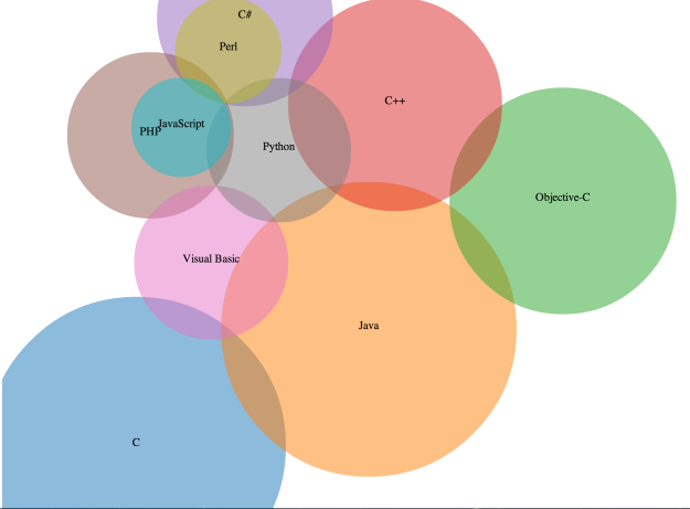
This gives us something which looks like
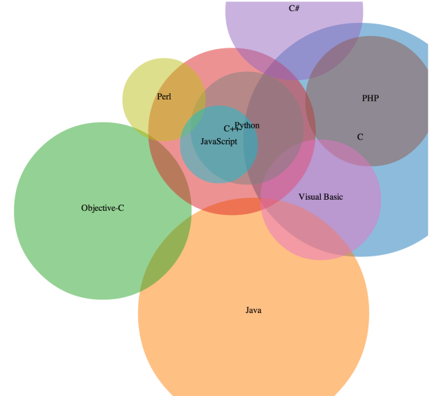
I like this a lot! However because our bubbles only care if they overlap the previous we do sometimes end up with a mess like
We’ll look at some ways to deal with this in an upcoming post. You can get the full code for this over at github.


