HTML 5 Data Visualizations - Part 5 - D3.js
Note: I will be presenting a talk on data visualization in HTML5 on February the 14th at the Calgary .net user group. Keep an eye onhttp://www.dotnetcalgary.com/ for details. This blog is one in a series which will make up the talk I will be giving.
Thus far we’ve made use of either pure SVG or made use of theRaphaëllibrary. Both were pretty simple but using a library certainly made things a bit easier and gave us access to more powerful programming tools. Now if you happent to have gone over to theRaphaël web site you might have seen some really impressive demos of drawing a tiger in SVGwhich just blows my mind. There are also a number of demos of graphs which are pretty impressive. HoweverRaphaël is a general purpose SVG library and isn’t designed specifically for making data visualizations. There is another library called d3.js which has been created for exactly our purpose. Cool.
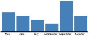
Okay well let’s do the same thing we did earlier and rebuild our original graphing demo making use of d3.js.
Yay, giant block of code! To start with it looks like we’ve managed to get rid of a lot of the declarations which cluttered our function last time. d3.js has a bunch of utility functions which allow our code to be more terse. For instance we no longer need a our own function to find the maximum element in an array, d3.max will do that for us(line 21).
d3.js places a lot ofemphasison method chaining. If you want to set a number of attributes then you can just make multiple calls to attr. It is a clean way to programatically build up properties of the graph objects.
Lines 11 through 13 create an SVG element in the given container. You’ll notice that as soon as we create the element with append we can start adding attributes to it.
Next we set up a scaling factors.
d3.js has some great tools for setting up graph scales. Here we see two different examples. The first is using an ordinal scale, this means that we have a discrete set of input, or domain, elements. Our data contains a number of months and we map each one of those to something in a range. We map our domain to a rangeBand in this example. A range band is a continuious interval and the function will find a number of evenly spaced discrete values within that band to mark as output points. We also give it a padding of 10% to allow for spacing between our columns.
For the vertical, or y scale we use a simple linear scale taken from the domain of 0 through to the maximum value in the data set. For the range we use 0 through the maximum height of the bar which we set up earlier.
Here we are setting up the x axis labels by appending a new element to the graph and setting the properties.
Finally the actual bars of the graph are set up. Using data directive we set up the data used to drive our graph. Enter acts much like a map directive which calls the code that follows for each element of the data. This is where we use the various scaling functions we set up earlier.
The result?
I really like the declarative syntax of d3 and I’m going to tie my horse to it for future data visualization projects.
